Costa Coffee
 UK · Product design
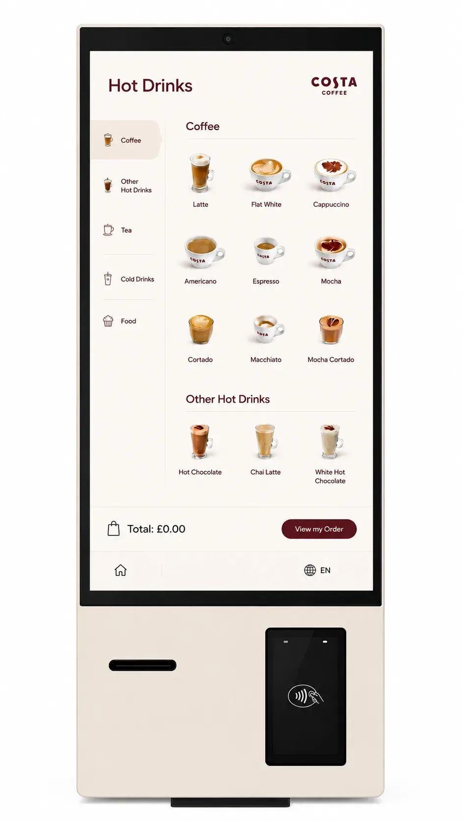
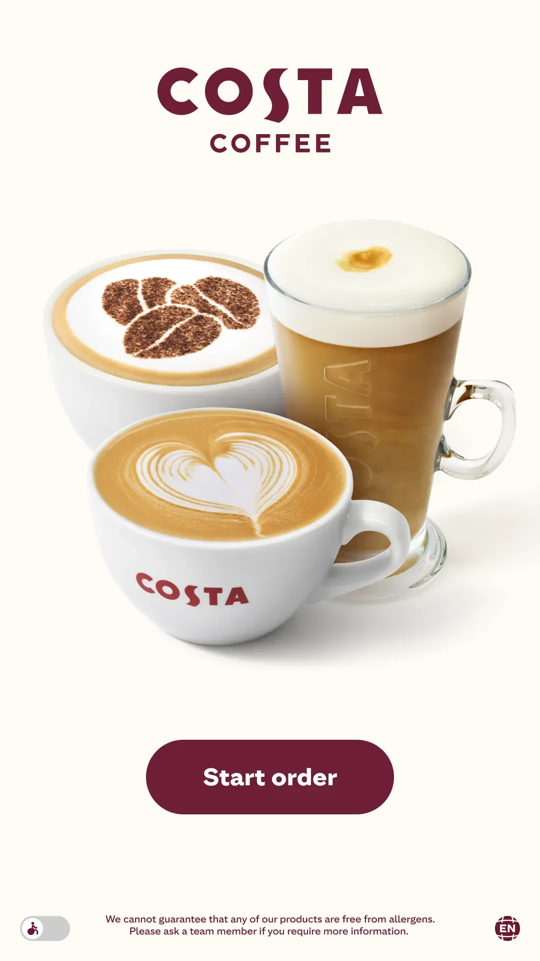
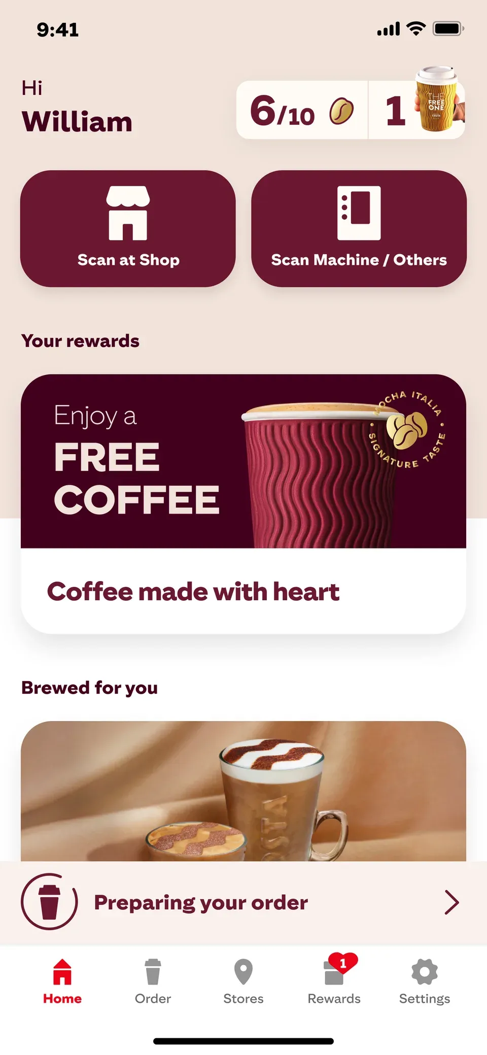
Costa Coffee needed a cohesive design system across their digital touchpoints. I led the UX/UI redesign for both the Self-Order Kiosks and the Mobile App, aiming to reduce queue times, simplify complex drink customizations, and seamlessly integrate the Costa Club loyalty program.
 Figma
 Claude
 UserTesting
 Miro
 Gemini


+18%faster ordering
+18%faster ordering
User-Centric & Storytelling
To identify usability bottlenecks, I ran remote UserTesting sessions with frequent customers.
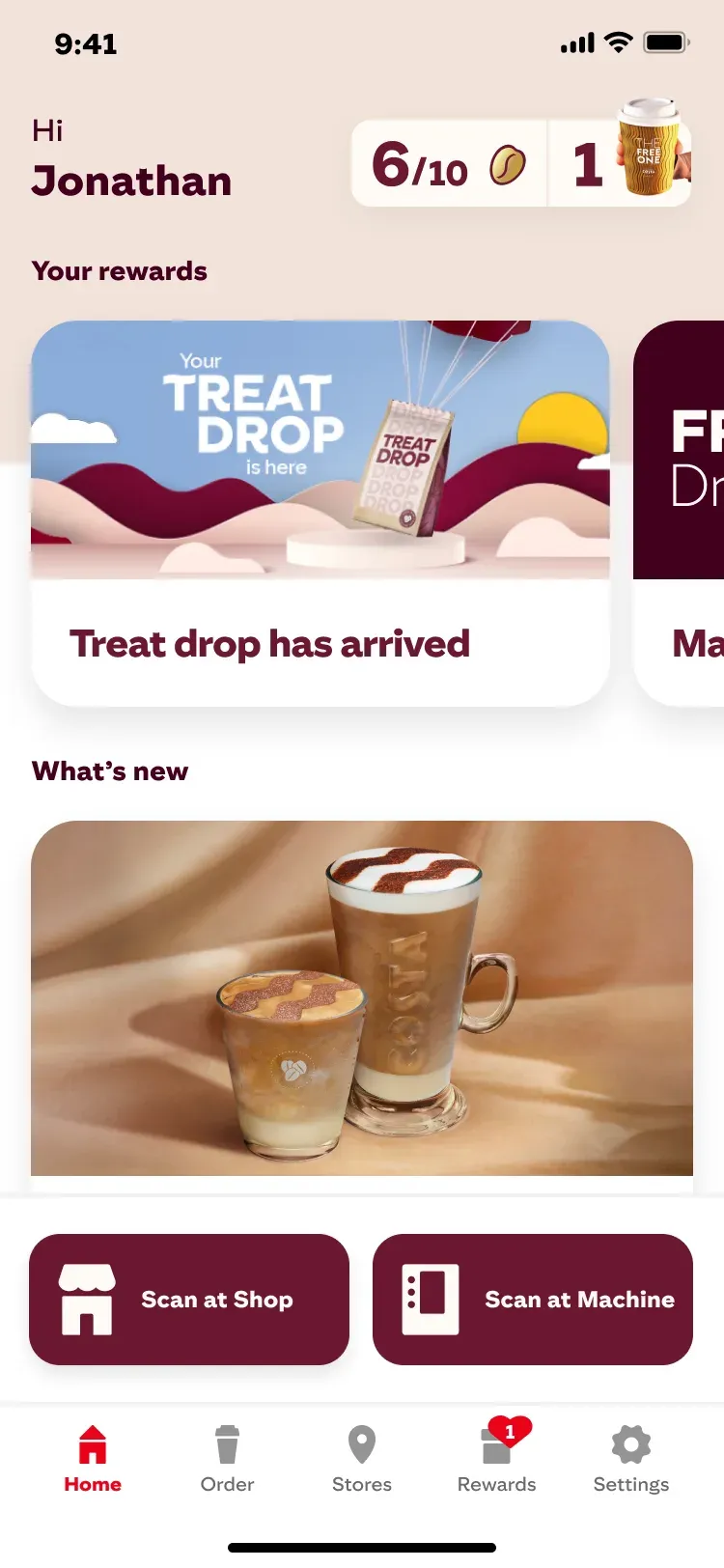
Their feedback directly shaped the redesign around three core themes: frictionless scanning, zero‑scroll offer visibility, and visual reward tracking.

- Scan at Shop
Interview with Sara17 Jul 2026Sentiment: Positive The feature I use most often is to scan at the shop, and then eventually, once I do that 10 times, I make sure I go onto the rewards to get the free coffee.
- Reduce scrolling
Interview with Klay19 Jul 2026Sentiment: Neutral Offers should be front and center the moment I open the app. I'm usually in a hurry when ordering, so I want to see any deals right at the very top.
- Self-Explanatory Stamp Card
Interview with Martin21 Jul 2026Sentiment: Positive When you tap the Stamp Card, it clearly shows the process: collect beans, get a free drink. It's so simple and visual that you don't even need words.
- Scan at Shop
Interview with Belen15 Jul 2026Sentiment: Neutral My main interaction is just scanning at the shop to collect beans and redeem my rewards. Ultimately, I use the app because I want free coffee.
- Reduce scrolling
Interview with Alex20 Jul 2026Sentiment: Negative I find myself scrolling past too much promotional stuff just to find my current bean balance. It would be much better if my progress was fixed at the top.
- Self-Explanatory Stamp Card
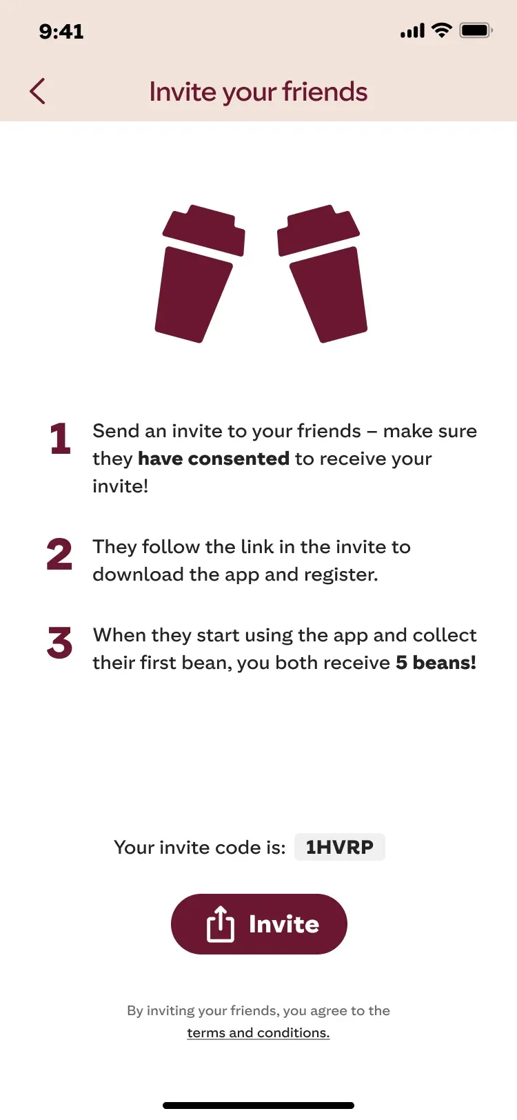
Interview with Sara17 Jul 2026Sentiment: Negative The onboarding clearly explains how to earn beans, but doesn't tell me what they are actually worth in real terms. What else can I use them for?
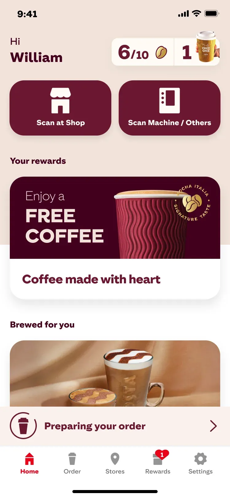
Mobile App (Click & Collect)
Data analytics highlighted major drop‑off points in the app:
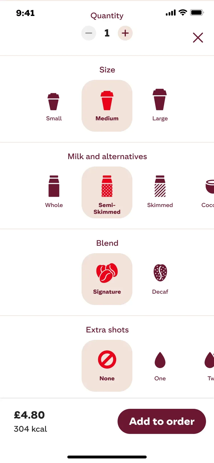
- Regular commuters found building their daily custom drink from scratch too tedious.
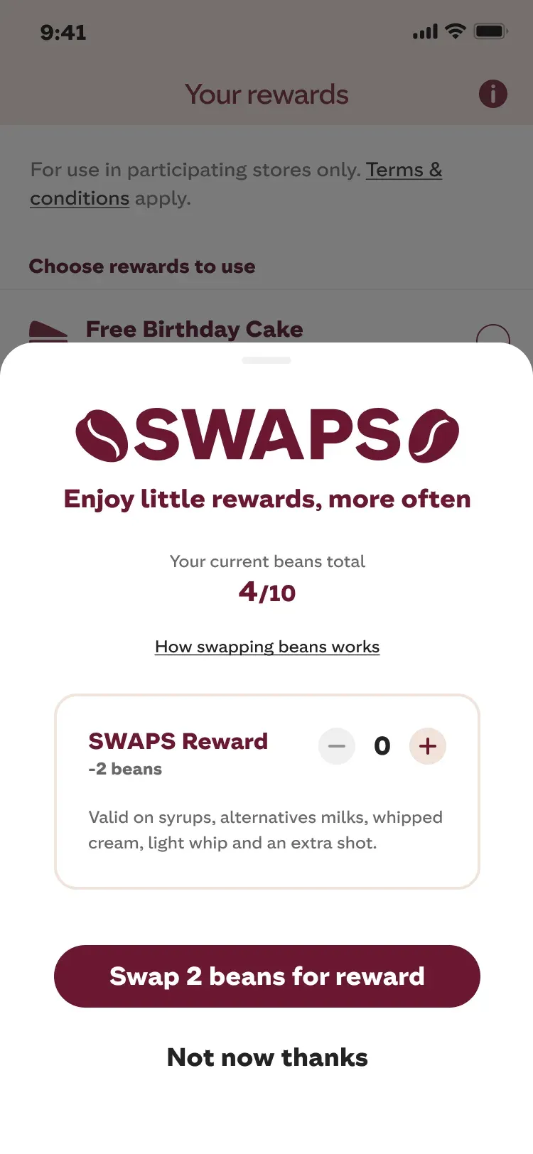
- Users frequently forgot to apply their “Costa Club” beans before checkout.
- Manual credit card entry caused a 40% drop‑off at the payment step.
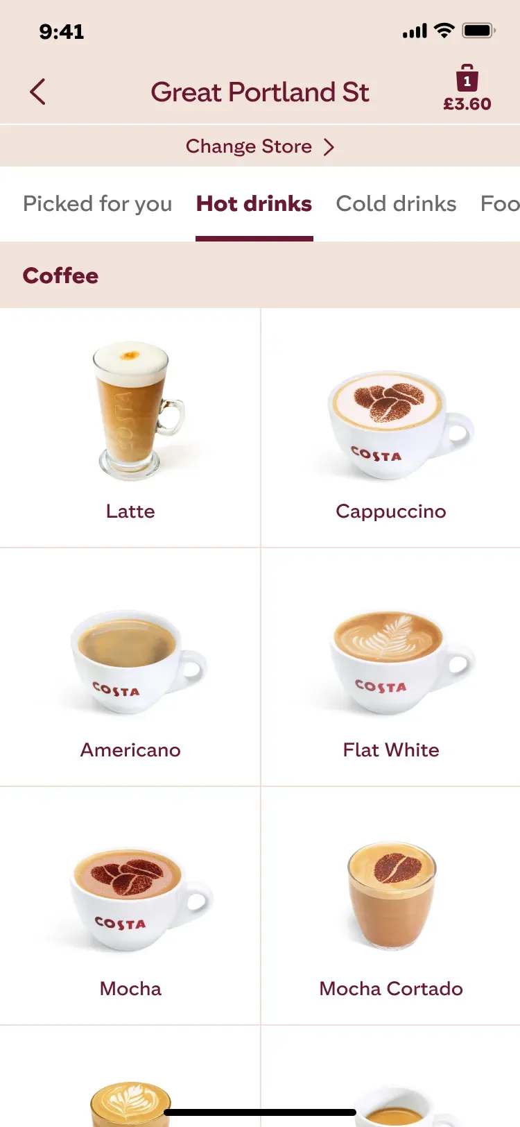
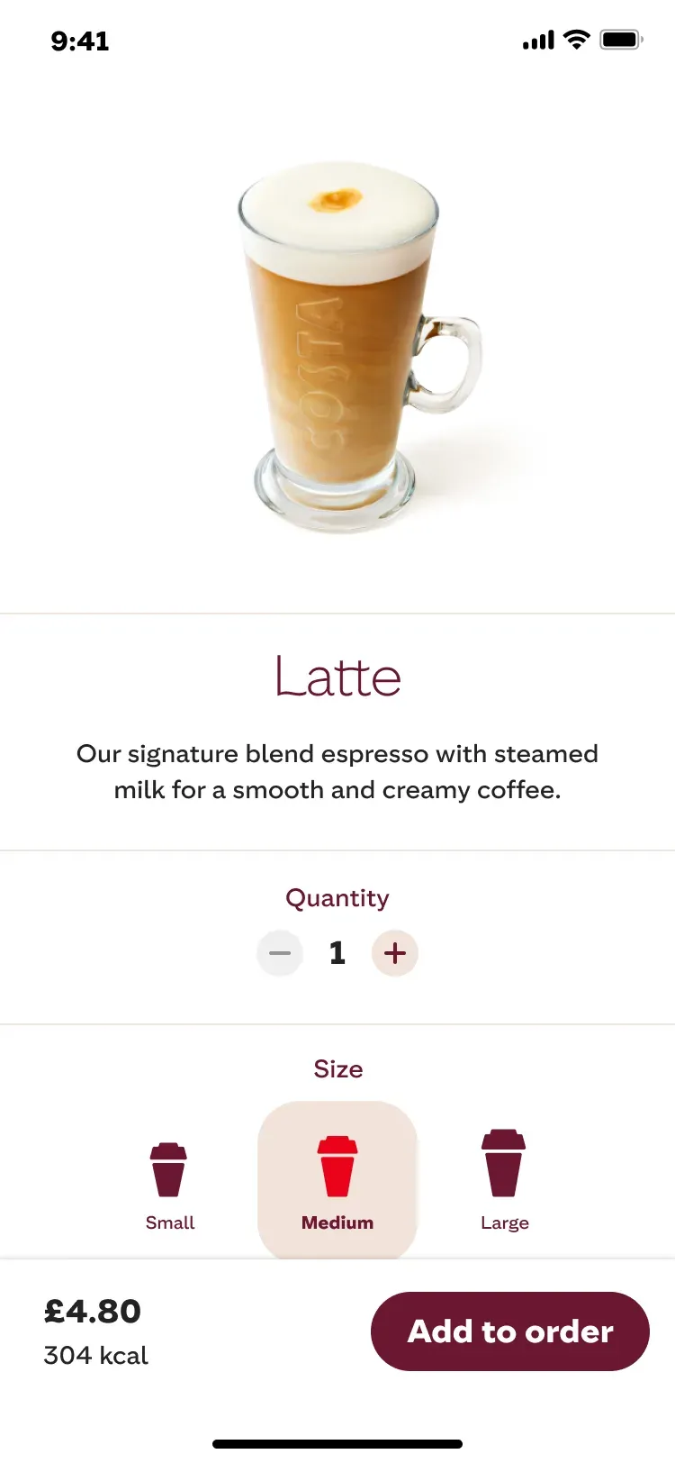
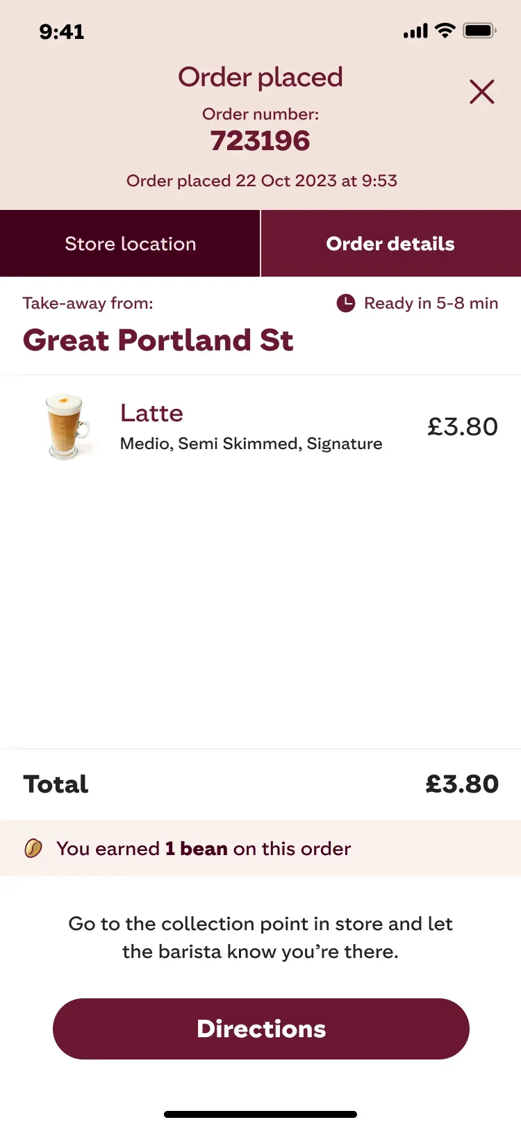
+18%Mobile Order Conversions Through a Frictionless Flow
I worked with the team to redesign the app’s core architecture:
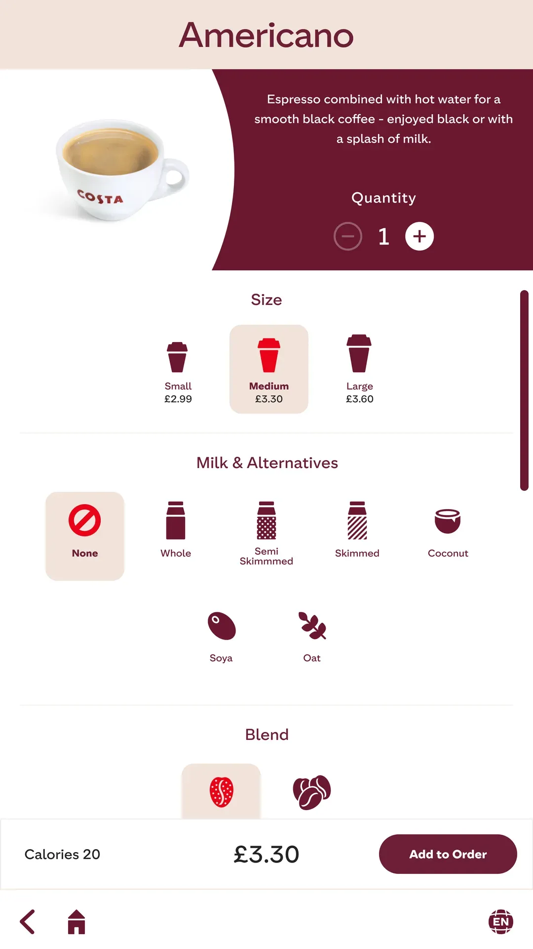
- Restructured complex drink customizations into a clean modal to prevent funnel drop‑offs.
- Merged rewards seamlessly into the checkout to drive instant redemptions.
- Scaled UI components to ensure full iOS and Android accessibility compliance.
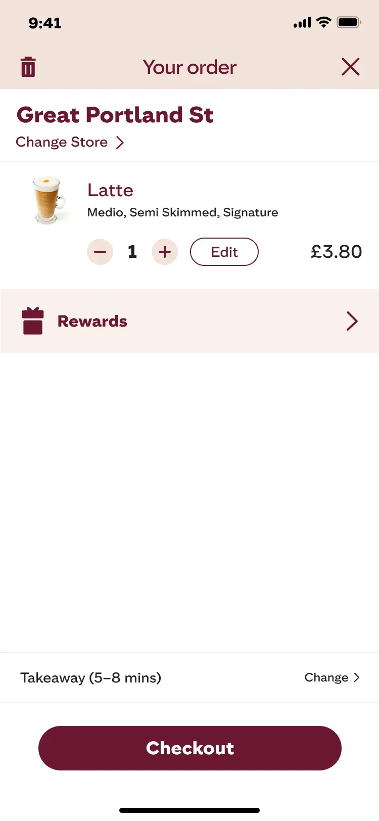
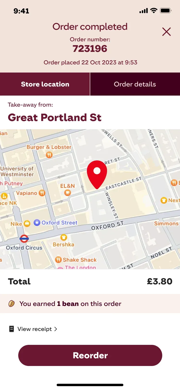
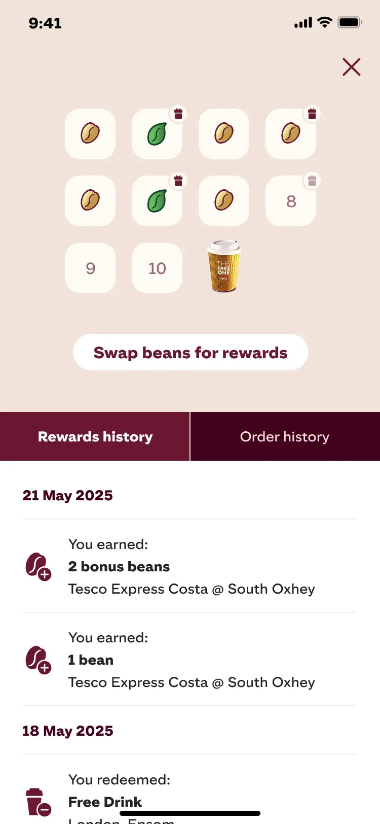
+25%Reward Redemptions with Transparent Rewards
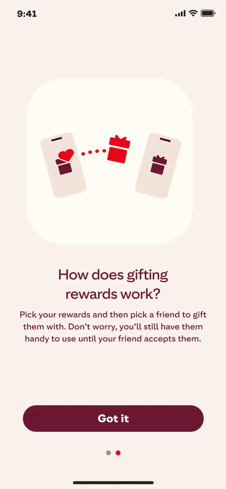
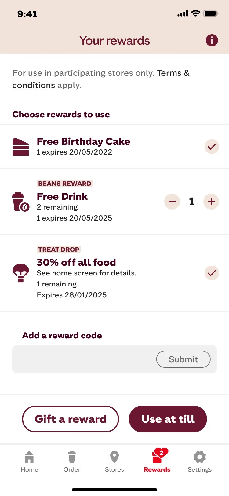
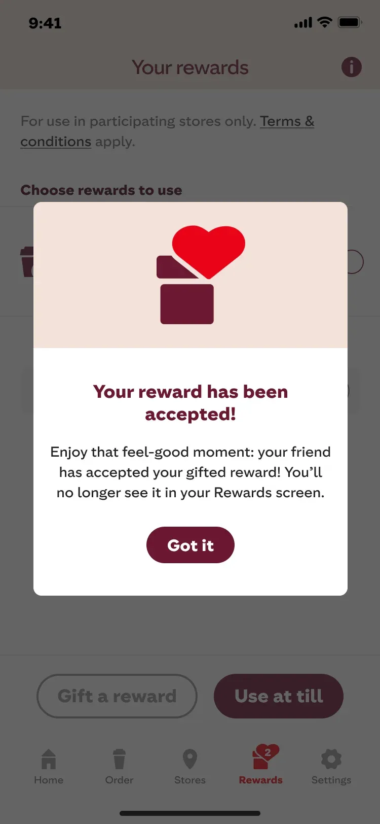
Users knew how to collect “Beans” but didn’t grasp their value.
I redesigned the hub to make the exchange rate completely visual:
- Replaced text‑heavy rules with intuitive progress trackers to reduce cognitive load.
- Mapped collected beans directly to tangible food and drink rewards.
- Added Lottie animations to earned rewards to drive positive reinforcement.
+28%Mobile Checkouts & A Unified Ecosystem
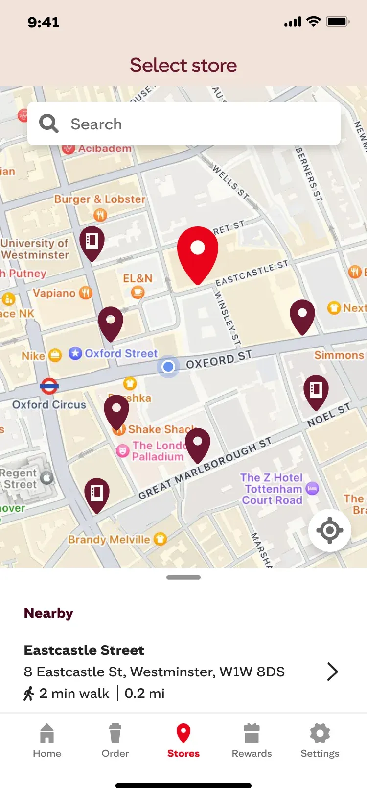
The native‑first redesign turned the Costa app into a frictionless daily habit.
Aligning the digital and in‑store experiences eliminated major drop‑offs:
- Streamlined the end‑to‑end user journey, lifting mobile order conversions.
- Integrated the loyalty ecosystem natively, driving more Costa Club reward redemptions.
- Established a scalable, WCAG‑compliant design system that unified the brand across all digital touchpoints.
- Replaced unique custom UI elements with one cross‑platform library for the app and kiosks, cutting them by 45%.
- Standardized components in Figma, speeding up design handoff to development by 30%.
Self-Order Kiosk: Designing for Physical Spaces
Designing for hardware requires moving beyond standard web rules.
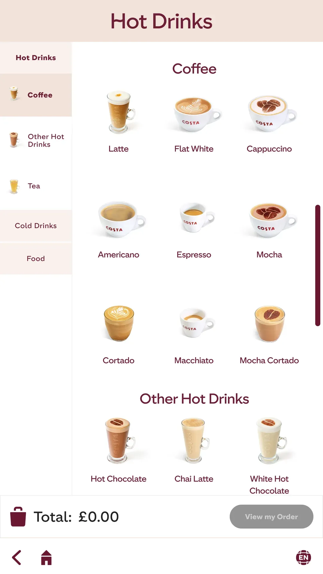
In‑store observations revealed that the legacy kiosks were actively slowing down the morning rush. The UI was overly complex, touch targets were too small for quick interactions, and upselling felt intrusive. I led the complete redesign to prioritize speed, accessibility, and frictionless upselling.
Hardware Ergonomics & Accessibility
Kiosk interfaces must be universally accessible, regardless of user height or store lighting:
- Scaled typography and touch targets (48x48dp min) for readability at a distance.
- Mapped critical actions to the bottom “thumb zone” for easy physical reach.
- Adjusted brand contrast ratios to strictly meet WCAG 2.2 AA in bright environments.
Accessibility
Comply with WCAG 2.2 standards to ensure accessibility for all users.
- AbcPASSPorcelainDeep Red
- AbcFAILAccent RedLatte
- AbcPASSCosta RedLatte
- AbcFAILCosta RedDeep Red
- AbcPASSDeep RedPorcelain
- AbcFAILCosta RedAccent Red
- AbcFAILCosta LighterCosta Light
- AbcPASSPorcelainAccent Red
- AbcFAILDeep RedCosta Red
- AbcPASSPorcelainCosta Red
- AbcFAILPorcelainLatte
- AbcPASSDeep RedLatte
−20%Kiosk Order Time
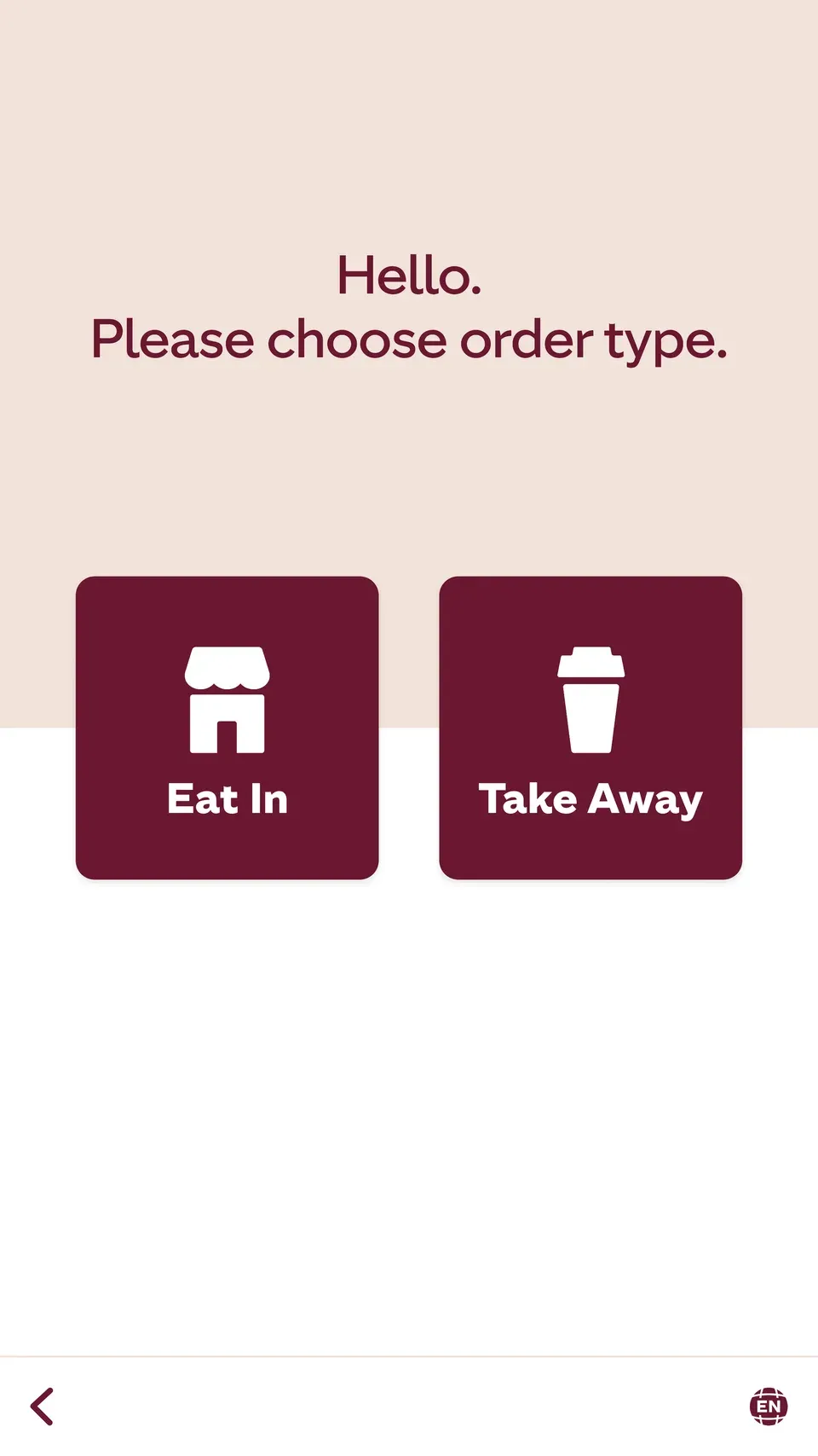
The endless‑scroll menu caused severe decision paralysis during peak hours.
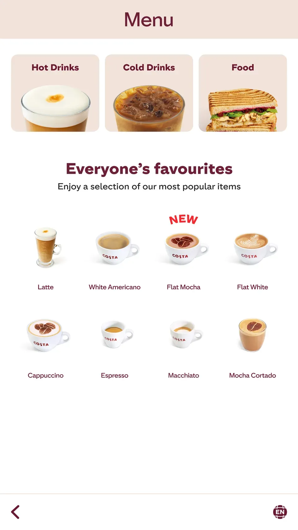
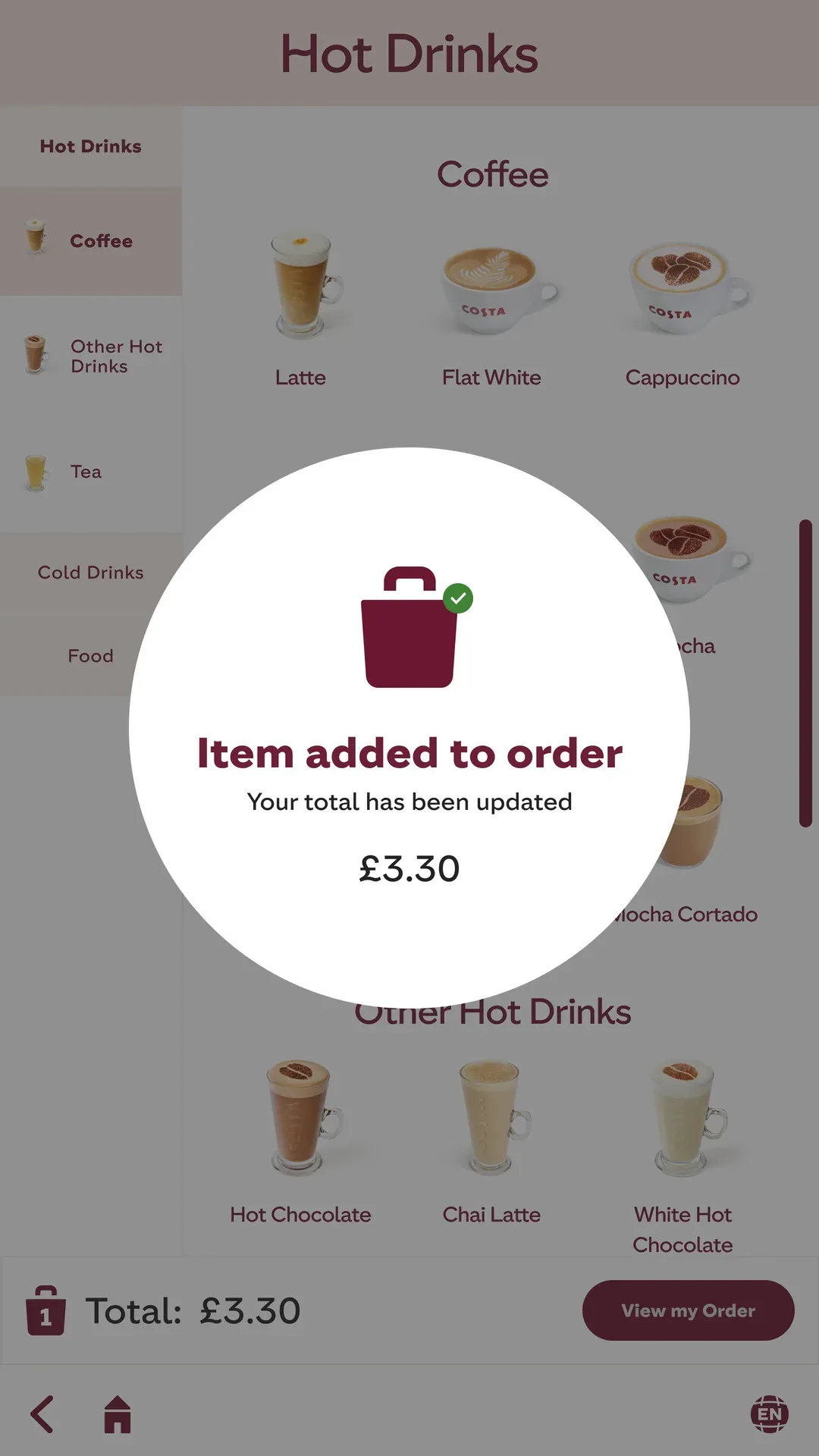
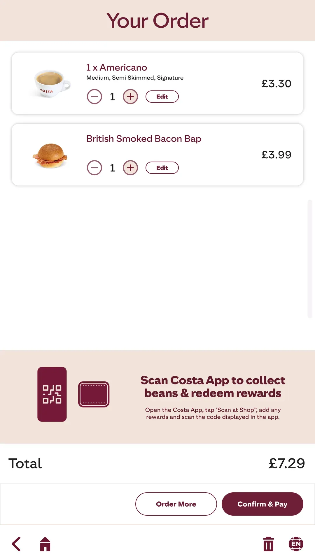
I restructured the core ordering architecture to fast‑track standard purchases. Simplified navigation and a reworked cart flow shortened the average order time.
+14%Cross-Sell Conversion for Add-ons and Desserts
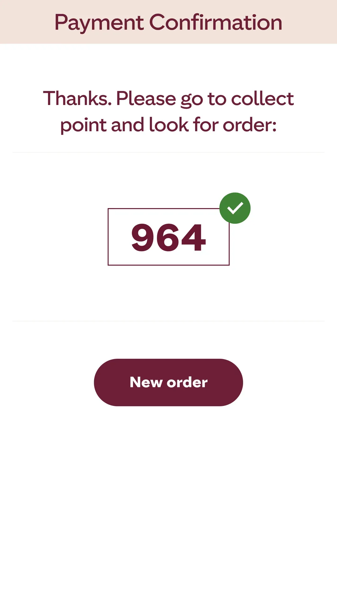
The new Self‑Order Kiosk seamlessly connects the mobile experience with the in‑store environment. By adapting proven, user‑tested UI patterns for large‑format screens, I created an intuitive, highly accessible, and rapid ordering system designed specifically to handle the pressure of the morning rush.
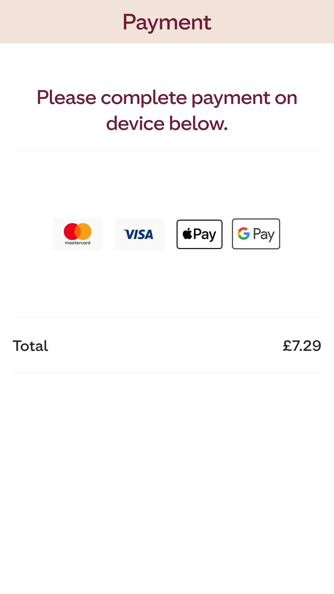
Reworked recommendation logic before checkout increased cross‑sell conversion for add‑ons and desserts. Making contactless payment more predictable reduced abandoned terminal sessions by 12%.
Key Takeaways from the Journey

Vladimir Kvach
LinkedIn →The Complexity of Physical Contexts
The biggest challenge in designing the Self‑Order Kiosk (SOK) experience was accounting for the physical environment and the sheer diversity of our users. Unlike a personal mobile app, a kiosk is a shared, public‑facing interface operating in fast‑paced, high‑stress environments.
It required architecting a UI that is highly legible under varying lighting conditions, physically reachable for users of all heights and abilities, and intuitive enough to minimize cognitive load during a rushed morning commute.
Every touchpoint had to be optimized for large screens, ensuring that contrast ratios, tap target sizing, and typography met strict accessibility standards without diluting the brand’s visual warmth.
The Core Lesson: Accessibility is the Experience
This project reinforced that true user‑centric design goes far beyond the screen: it is deeply rooted in human context. Accessibility cannot be treated as a compliance checklist or an afterthought.
By building an inclusive, hardware‑aware design system from the very beginning, I learned that prioritizing extreme usability for edge cases doesn’t just help a specific group; it ultimately creates a faster, more frictionless, and more delightful ordering experience for absolutely everyone.
Want to learn more about the process and design decisions?
Let’s talk